jonsparrow
260 posts
May 08, 2009
11:00 PM

|
well heres some stuff i came up with based on the comments here. let me know what you think an if any improvements can be made i see what i can do. i could have spiffed it up all fancy like but being that its a shirt i tried to keep it simple.
|
isaacullah
237 posts
May 08, 2009
11:06 PM
|
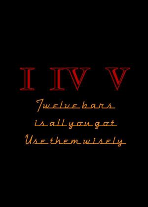
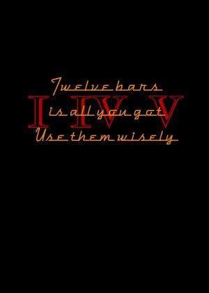
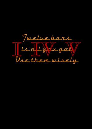
jonaparrow: I like it! I vote for the middle one where the I IV V are behind the lettering. I think that one "pops" the most.
Preston: can you scan a hand drawing? if so, e-mail it to me. I've got software that can autotrace a scanned bitmap into a nice infinitely scalable vector line drawing. Send me a PM by YouTube mail and I'll give you my e-mail address.
~Isaac
----------
--------------
The magnificent YouTube channel of the internet user known as "isaacullah"
|
b1ueskyz
29 posts
May 13, 2009
2:57 PM
|
When you guys decide what you want to put on what... let me know.
My son has a 'promotional printing' company or whatever you call it. And he said he'd do t-shirts, hawaiian shirts, silkscreened, embroidered or whatever we want. For a friend's price. They can even do up the artwork.
|
Preston
344 posts
May 13, 2009
3:16 PM
|
Awesome! Yes, I've been looking for free ware with no success. I'll scan in my hand sketch and see if you guys like it.
Jonsparrow: I like the second and third pics. That is what I was thinking, only maybe the I-IV-V should be faded out, so the phrase is prominent. Just a suggestion.
|
Patrick Barker
277 posts
May 13, 2009
3:37 PM
|
I like that font and the designs- although I think the simpler two line "Twelve bars / use them wisely" would be cooler
----------
"Without music, life would be a mistake" -Nietzsche
|
phil
18 posts
May 15, 2009
5:26 AM
|
i could see myself buying a tastefully designed t shirt based on
"I IV V"
"twelve bars,three chords"
or "twelve bars, repeat"
even a very small "modernbluesharmonica.com" incorporated into the design would be cool.
but the kiss principle applies.
|
Preston
351 posts
May 15, 2009
6:14 AM
|
I'm still working on the logo. I haven't forgotten about this project. The original sketch I did was just a hand sketch. I think with a protractor and a ruler I can get it a little more presentable and ready to scan and send.
|
bluzlvr
191 posts
May 15, 2009
3:25 PM
|
I've designed "Blues Power" logos using PhotoShop and Illustrator, and employed the iron-on thingies that you can buy everywhere. They're fairly cheap and surprisingly durable.
Of course, mass production is out of the question.
Another problem is if you want white on a black t-shirt, you have to iron on a piece of white material under the logo. I've done it and it works.
|
Preston
356 posts
May 19, 2009
7:01 AM
|
I have the logo done. I'm going to send it to Isaac as soon as he checks his damn YT account and sends me his personal email address!
I'm not sure how to post pictures here, so Isaac, can you let everybody see it when you get it? If nobody likes it and doesn't want to use it, I won't be offended, it's just what came to my mind.
|
Preston
359 posts
May 19, 2009
8:14 AM
|
Let me try this:

By prestonamoore at 2009-05-19
|
Preston
360 posts
May 19, 2009
8:16 AM
|
It worked! Thanks ODA!
Here's what I was thinking on a shirt:

By prestonamoore at 2009-05-19
I was thinking on a white shirt to have Red letters and 10 holes in black.
On a black shirt white letters and 10 Red holes!
Let me know what you guys think.
|
kudzurunner
439 posts
May 19, 2009
8:42 AM
|
jonsparrow:
The "cadillac modern" typeface seems a little cluttered to me. I'm thinking you want a bold, sans-serif statement.
I know I should be more invested in the whole process--there's probably big money in it--but I've got too much else on my plate. I keep meaning to investigate Cafe Press, but again: to many other things going on.
Isaac: I like your post from May 8, 4:21 PM (bottom of the first page of this thread. If you'll be our Decider and pick out the logo and set it up on Cafe Press, then I will keep the profit margin (i.e., my take) low and we will get this done.
The great advantage of Cafe Press is 1) they offer whatever sizes you want, so nobody here gets stuck with 53 Medium t-shirts when everybody buys Large; and 2) they do all the fulfillment--taking orders, stuffing shirts into mailers, affixing postage, etc.
I think Cafe Press is really the most workable way.
Isaac: email me (asgussow@aol.com) and let's talk.
|
djm3801
122 posts
May 19, 2009
2:36 PM
|
Wow. When I started this thread I started to feel like I was suggesting the corniest possible thing on a blues site. I guess a lot of folks DO like the idea! I wear what I want. The ideas are good ones. I hope it brings in a few bucks and it may be an easy way for Gussow fans to spot one another without being referred to as Nerds or geeks or worse.
Dan M
|
Patrick Barker
292 posts
May 19, 2009
2:53 PM
|
Nice logo preston!
----------
"Without music, life would be a mistake" -Nietzsche
|
GermanHarpist
345 posts
May 19, 2009
3:03 PM
|
Yes, good one, Preston. Very cool!
----------
germanharpist, harpfriends on Youtube
|
nacoran
16 posts
May 19, 2009
3:48 PM
|
I always wanted a tee-shirt that said, "I'm a harmonica player- When I don't suck, I blow"
|
isaacullah
250 posts
May 19, 2009
4:25 PM
|
I made Preston's scanned logo into a infinitely scalable vector format (line drawing). Here's a png (bitmap) export of it so you can see how it looks. What do people think about colors? Is greyscale okay, or should the lines be in color (deep red for example)? I think the insides of the holes should be filled like this, with grey or another light color.

Adam, I'll e-mail you about cafe press...
----------
--------------
The magnificent YouTube channel of the internet user known as "isaacullah"
Last Edited by on May 19, 2009 4:27 PM
|
jonsparrow
318 posts
May 19, 2009
7:43 PM
|
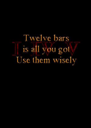
i like that preston.
well heres anouther edit with suggestions used. although im not sure what type of sans-serif you had in mind adam, so i tried this one.
the first one has the I IV V faded a bit then the original an the 2nd is disintegrating.
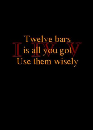
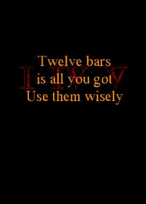
heres anouther...
 Last Edited by on May 19, 2009 8:00 PM
|
jonsparrow
319 posts
May 19, 2009
8:08 PM
|
it would be cool to have prestons logo on the front an mine on the back.
|
isaacullah
251 posts
May 19, 2009
10:13 PM
|
@jonsparrow: FYI, sans serif means without serifs. Serifs are those little "knobs" or "dangles" on the ends of straight parts of the letters. For example, the font I'm currently writing in is a sans serif font. "Courier" and "Times New Roman" are serif fonts. Serif types are easier to read when the are in the body of the text, but the serifs are distracting when the text is large as in a sign or title of a book or a log like this one. Sans serif fonts are way better for this kind of application, which is why I think Adam suggests we use one. Arial is a good example of sans serif font, but there are many other really nice ones. I use Tahoma, Trebuchet, Century Gothic, Free Sans, and Deja Vu Sans for a lot of graphics I do...
I really like version one above. The colors are really nice, and the contrast between the red roman numerals and the text stands out very well. I'll colorize Prestons logo in a similar manner and post it up.
----------
--------------
The magnificent YouTube channel of the internet user known as "isaacullah"
Last Edited by on May 19, 2009 10:38 PM
|
jonsparrow
320 posts
May 19, 2009
11:45 PM
|
ooohhh ok thanks for the lesson.
|
Preston
362 posts
May 20, 2009
5:52 AM
|
I'm glad you all liked the logo. However after talking with Adam it is going into re-design! I'll keep you posted.
Jonsparrow: I had always intended your logo on the back and mine on front! Great minds think alike.
|
kudzurunner
440 posts
May 20, 2009
9:56 AM
|
Jon:
I like that much better. That's really very good. The only potential problem is see is durability: it seems as though you've got to keep the I IV V icons somewhat more....faded than the three-line saying, and yet after you've washed the t-shirt ten times, the faded numerals will fade still more. But the whole thing gels nicely.
Of course the English prof in me is questioning the precise wording. Shouldn't it be either:
"Twelve bars is all you've got" or "Twelve bars is all you get"? Pick one!
As for Preston's logo: I didn't think it quite worked and emailed that to Preston. Here's a question: don't the words "modern blues harmonica" belong somewhere on the t-shirt? As it stands, you're talking about a saying on the back and a logo on the front with MBH, but there's nothing with the words "harmonica" anywhwere on the shirt, not to mention the name of this website. I understand that one of the attractions of the whole project is to create a sort of underground code that only we get. But is that really what everybody wants?
Personally, I'd like "modernbluesharmonica.com" somewhere on the thing. But that's just me. :)
One final and IMPORTANT note: it is my intention, once we've settled on a design and commissioned Cafe Press to work up some t-shirts, to begin with a two-week period--heavily promoted on this forum only--during which time folks here will be able to purchase t-shirts AT COST, with no profit whatever accruing to me. That way, everybody here can get a good cheap t-shirt. After that, we'll raise prices to where they'd normally be in this sort of operation and we'll let everybody else know.
|
kudzurunner
441 posts
May 20, 2009
9:58 AM
|
I think it should be
Twelve bars
is all you get
Use them wisely
|
RyanMortos
177 posts
May 20, 2009
10:34 AM
|
Just an idea. How about putting the www.modernbluesharmonica.com on the bottom of either the right or left sleeve?
----------
~Ryan
PA
Ryan's Tube - Containing [0] uploads and counting...
|
jonsparrow
324 posts
May 20, 2009
10:48 AM
|
ya i was thinking the sleeve too.
|
isaacullah
252 posts
May 20, 2009
11:32 AM
|
Hi guys. Adam has commissioned me to take the point on this, and I have accepted this duty. So, here's what has been decided so far. We will leave this thread open for logo/design submissions until mid-July. Then we'll see what we've got then. If there is a need to decide between competing designs, I'll set up a way to do anonymous e-mail voting, and we will use the winner. I'll then set up a cafepress store front with several choice items, and Adam will link it from here. Like Adam said, there will be a two week time-period for forum members to buy items "at cost", after which the prices will go up slightly so that Adam gets a percent profit.
We will be using cafepress.com for this. I suggest that anyone interested in contributing a design/logo read the cafepress design sugggestions . There are many products that we can make available. Most clothing items have 3 locations for printing. These are: 1) The front pocket area (6x6). 2) The back (large format). 3) The sleeve (small)
I think that the sleeve is a great place for the site URL. We'll look into a good font that is pleasing to read.
The front pocket is a perfect location for a logo, while the back is good for a larger design/image/slogan.
I'll be checking in from time to time, but I'll be traveling for the next month or so, so I won't be super active in the forum for that time...
I'm looking forward to seeing all the submissions!
Cheers,
Isaac
----------
--------------
The magnificent YouTube channel of the internet user known as "isaacullah"
|
Patrick Barker
300 posts
May 22, 2009
4:12 PM
|
I really like that MBH logo- bumper stickers or wonder stickers with that MBH logo would be pretty awesome too if they were easy to make.
----------
"Without music, life would be a mistake" -Nietzsche
|
djm3801
125 posts
May 22, 2009
6:40 PM
|
Man - this has turned out to be quite an ordeal, and a good one. Jon, Issac, Preston, great suggestions and kudos to you guys. Sleeve idea for URL excellent. I belong to a woodworking group and We have a large logo on back and a smaller on around where the breast pocket would go, or on the pocket if there are a lot of smokers in the group (I always had pocket Tees when I smoked.). A bumper sticker - I have seen them on amps and equipment cases.... And of course on bumpers. Tell the truth, Adam's regular harmonica logo fits that idea quite nicely.
Can't wait to get mine - will have to wear an Asian flowered short to see Adam in Philly.
Dan
|
oda
104 posts
May 23, 2009
8:34 AM
|
I may be interested in contributing a logo to see what you folks think. Dan, what format would be suitable? Do you want a hand-drawing? or something more finalized in a certain format?
Also -- I'd like to throw this out there for serious consideration:
I've worked on a few sites that used Cafepress (all prior to 2006) and I have to say I hated what I saw. Cafe-press had poor quality shirts, and their Terms of Service changed as often as I did laundry. I believe their current TOS takes a cut of the sale as well as a % of the sellers commission...
I'm not sure what Cafe-Press is like now -- but I would advise that what should be done is someone make the shirts if it's within their means to print them; and in order to avoid having some left over perhaps this board can spend 1-2 months advertising the shirt sales and people can "pre-order" them, allowing whoever makes them to make only those that were ordered and avoid left overs.
|
djm3801
126 posts
May 23, 2009
10:22 AM
|
I just started the idea by opening this thread. I think Issac said that Adam has him doing the coordination. Preston and Jonsparrow did the creative brain work. I am the "light fuse, run away.." guy.
Dan M
|
phil
19 posts
May 24, 2009
6:20 AM
|
i was wondering about the quality of their shirts as well..
i have an entry for the design a shirt competition :-) , can anyone tell me how to get an image from my desktop (mac) into this thread?
|
jonsparrow
338 posts
May 24, 2009
9:24 AM
|
upload your pic to
www.photobucket.com
you have to create an account.
then copy an paste the html code to here.
|
phil
20 posts
May 25, 2009
4:44 AM
|
thanks jonsparrow , here goes.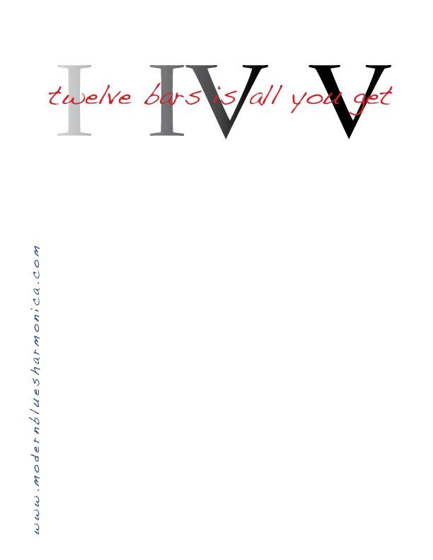 Last Edited by on May 25, 2009 4:51 AM
|
phil
21 posts
May 25, 2009
4:57 AM
|
whoa! a little bigger than i thought.
a white t-shirt and the MBH url could go horozontal down low back or front, or vertical offset to the side and low back or front.
|
Miles Dewar
349 posts
May 25, 2009
10:33 AM
|
Should there be so much going on?
Maybe we could just have a simple:
Modern
Blues
Harmonica
.com
----------
---Go Chicago Bears!!!---
Last Edited by on May 25, 2009 10:34 AM
|
jonsparrow
348 posts
May 25, 2009
10:42 AM
|
the more goin on the more attention it will get. if its too simple it would make it look cheap an homemade.
|
harpinonfire
3 posts
May 27, 2009
11:36 PM
|
I'm a retired fire cpt. I wear fire t-shirts. I love learning harmonica and I would wear harmonica t-shirts, do now. Don't know where the 'nerd' stuff comes from. Wimpy egos I guess. One suggestion is since adam would like to see Modernbluesharmonica.com on the shirt. I'm partial to the logo of harmonica at the top and if the words Modern Blues Harmonica was moved slightly to the left it would leave room to add (.com) prestow, kill to birds with one stone. Just a thought. Anyhow I'm in and I do smoke so where's the pocket. No matter.
|
kudzurunner
609 posts
Jul 28, 2009
4:42 AM
|
Isaac:
Wasn't this roughly the time--late July--when you and I were going to revisit the issue of MBH t-shirts? Email me if you'd like to move ahead: asgussow@aol.com
|
Oliver
89 posts
Jul 28, 2009
4:55 AM
|
Uhh, shouldn't it be 'Twelve bars ARE all you've got'? Not 'is all'.
Out come the grammar police!
And guys, nice work on the graphics / layout!
Last Edited by on Jul 28, 2009 4:56 AM
|
Kingley
291 posts
Jul 28, 2009
5:02 AM
|
For what it's worth,
I think Prestons design (may 19 2009) on the front left would look great with Phils design with a slight alteration(may 25 2009) on the back would look great!
Now to me that would be a really cool t-shirt!
Last Edited by on Jul 28, 2009 5:14 AM
|
Mgimino
46 posts
Jul 28, 2009
10:43 AM
|
That one's a winner IMO.
Having one in blue with white text would be awesome.
----------
Michael
|
isaacullah
277 posts
Jul 28, 2009
3:13 PM
|
Adam, I sent you an e-mail.
Cheers,
Isaac
----------
--------------
The magnificent YouTube channel of the internet user known as "isaacullah"
|
jonsparrow
677 posts
Jul 28, 2009
6:39 PM
|
i still vote for prestons an mine.
|
DevonTom
10 posts
Jul 28, 2009
6:51 PM
|
All you got or all all you get?
|
kudzurunner
611 posts
Jul 28, 2009
6:54 PM
|
All you get.
The question is, Should the first half of the sentence be "Twelve bars IS...." or "Twelve bars ARE...."
I know that the latter is "correct," but I'm not sure that the former is altogether wrong.
"bars is" is, phonetically, slightly preferable to "bars are," I think. Alliteration beats assonance.
|
DevonTom
11 posts
Jul 28, 2009
7:01 PM
|
word. (sorry, bad joke)
|
jonsparrow
679 posts
Jul 28, 2009
7:16 PM
|
i think "Twelve bars IS...." sounds better. i dont use the word "are." its not part of my vocabulary.
|
Kyzer Sosa
6 posts
Jul 29, 2009
12:08 AM
|
i personally think its preachy to put the "use them wisely" line in there... 12 bars is all you've got, seems enough to get the point across. Id like to submit a design as well as it seems we arent absolutely settled on it. Ive done a couple of album covers and a logo for The Charlie Daniels Band...Myspace.com/armarsh75 for some pics if youre interested in looking. Ill sketch some things out and even offer up some takes on what has been produced here already. Stop me if I'm stepping on toes or past a deadline..
Last Edited by on Jul 29, 2009 12:09 AM
|
GermanHarpist
536 posts
Jul 29, 2009
9:55 AM
|
Not at all.
I wanted to check out your sketches on myspace, but it said you had to be my friend or something. I don't have a myspace account...
----------
germanharpist, harpfriends on Youtube
|