Honkin On Bobo
78 posts
Jul 29, 2009
10:58 AM

|
A full three months later the design is still being discussed?
Is this a government run operation?
|
isaacullah
279 posts
Jul 29, 2009
11:31 AM
|
For all interested: Yes, the design process is STILL open for submissions/suggestions. We had some great first designs, but Adam thinks that they aren't quite what he's looking for. We have a good slogan, and we are pretty close to cementing that up for good, but we still need a catchy design/logo to go on the front pocket.
Yes, it has been several months, but we put this on hold for the summer while I was away doing field work,a nd Adam was busy with other stuff too... But now I'm back and we are getting going on it again...
Cheers,
Isaac
----------
--------------
The magnificent YouTube channel of the internet user known as "isaacullah"
|
isaacullah
280 posts
Jul 29, 2009
1:28 PM
|
@Kyzer Sosa:
Hey, I'm the one spearheading this deal for Adam. Shoot me an e-mail at iiullah 'at' yahoo 'dot' com if you are still interested in designing a logo...
BTW, the myspace url you referenced above is either typoed or gone missing....
Cheers,
Isaac
----------
--------------
The magnificent YouTube channel of the internet user known as "isaacullah"
Last Edited by on Jul 29, 2009 1:30 PM
|
eharp
292 posts
Jul 29, 2009
3:10 PM
|
is this how little walter would do it?
|
Kyzer Sosa
7 posts
Jul 29, 2009
8:24 PM
|
myspace.com/armarsh sorry, I have at least the photos section available for all to see.
Ill get in touch with the proper autohorities with it.. come up with something and try to post it here...and hey!, if time isnt/hasnt been a factor, yes you want to take as much time as you need to get it right. Im no harp pro, but i do know a thing or two about design...it took almost a year for holiday inn to decide on their new look, and it was just a change of text! go figure///
Last Edited by on Jul 29, 2009 8:27 PM
|
Gwood420
7 posts
Jul 29, 2009
9:20 PM
|
i just designed a shirt the other day for my company.. and wouldnt mind helping...
when screen printing, USUALLY you work in colors.. i.e. one color, two color, full color.. how many are you talking for this shirt? it helps in the design when you know what you have to work with..
as for design, i just finnished 2 company logos, and have no problem working on a new one.. to me, it is just fun.. but i need to know what Adam wants..
i know you want "modern blues harmonica(.com)"
but what do you picture in your mind when you envision the shirt.. a few more guidlines would be nice...
do you think your hat from the youtube videos(hat in The Joyous Disciples of the Blues Harmonica)should be worked in? or maybe a harp.. an amp...? that mic you like to use... a cross roads? or something else.. the guy who i just finnished a logo for, wanted a shield incorporated into it in some way.. and that gave me at least a bit of direction..
what do you see??
Last Edited by on Jul 29, 2009 9:53 PM
|
Kingley
295 posts
Jul 30, 2009
12:43 AM
|
Gwood,
You have a god point there. Most "Designers" have no real concept of how printing works. CMYK / RGB / Pantones / Bleed / Type Safe, etc.
For anyone who is thinking of doing a design. My advice would be:
1. Use a vector based graphics package (Illustrator, Freehand, Lineform, etc), not a raster based one like Photoshop or Gimp.
2. Use CMYK as your colour palette.
3. Avoid lots of dark colours or complex gradients.
4. Avoid using ultra fine lines.
5. Outline (convert to paths) all your text before you send the file to anyone to avoid font issues.
6. Ask the printer to check the file for "overprint fill". Most good ones should do this anyway, and ask you if they have any doubts about any area of the design.
If you use Pantone colours,make a colour chart and specify the ones you have used.
Remember that what you see on your screen is not what will print, unless your monitor has been professionally calibrated.
You will always get some colour variation, however minor.
All the above will ensure that you get a top quality print (as long as you use a good printing firm of course).
Last Edited by on Jul 30, 2009 12:49 AM
|
Kyzer Sosa
8 posts
Jul 30, 2009
3:42 AM
|

|
Kyzer Sosa
9 posts
Jul 30, 2009
3:47 AM
|
I tried the text over the Numerals, but quite frankly it's just poor design... too hard to discern one from the other without fancy tricks.. additionally, due to the way the Roman Numerals are set up, though it is perfectly centered on the shirt, optically, it looks as if the Numerals are pulled left, slightly. An illusion. I added "..." to the end of 'get' to bring the first line of text just a bit left as well, to offset the effect of the Numerals and bring some continuity to it. The files I have are very large, suitable for any tee printer, and you really cant appreciate the details until you see it up close, near life size...
These are just comps, what you see here, I need to center up the .com logo above the I IV V, but you get the idea...
anyway, let me know what you think...
Last Edited by on Jul 30, 2009 4:02 AM
|
scstrickland
137 posts
Jul 30, 2009
4:02 AM
|
IMO the numerals are too large and text too small. I agree that text over numerals is visually confusing. Also I thought the colors and typeface of jsparrow's design had more snap. This design looks to me like something you would see on the bottom of a movie poster.
|
Kingley
296 posts
Jul 30, 2009
4:27 AM
|
Why not have something on the back like this:
www.modernbluesharmonica.com in a nice modern style font like Helvetica.
With a picture chart of all the bends, overblows, overdraws etc on say a "C" harp for example.
Then underneath put a tag line. Maybe something like "blues for the 21st Century"
Last Edited by on Jul 30, 2009 4:27 AM
|
jonsparrow
686 posts
Jul 30, 2009
7:43 AM
|
wow i like that. it looks like a movie poster or something.
|
Kyzer Sosa
10 posts
Jul 30, 2009
10:07 AM
|
on the shirt itself, the text below the numerals would be about as wide as your whole back, with letters nearly an inch high. I can always bump them up in size no biggie. I used other tees for comparison and rarely seen others use text, for body, larger than that... I see the movie poster reference, but two diff opinions on it for the same reasons...hmm
I thought that in keeping with the underground code nature of things, everyone in the room would see the 1,4,5. but youd have to be close to get the quote...
I also have an idea for Adam's "blue 3rd" he speaks about in his vids...a big blue three on the back of a shirt with a collage of harmonica masters hidden within the number as a homage perhaps to their passing wisdom.
Last Edited by on Jul 30, 2009 10:08 AM
|
markdc70
2 posts
Jul 30, 2009
10:24 AM
|
I personally really like Preston's MBH logo! It's not in your face obvious as to being harp related, which I think is cooler that way. Also, I could live without the "use them wisely" text too.
|
Kingley
301 posts
Jul 30, 2009
10:40 AM
|
"I personally really like Preston's MBH logo! It's not in your face obvious as to being harp related, which I think is cooler that way"
I agree 100%
|
scstrickland
138 posts
Jul 30, 2009
11:25 AM
|
Im down with the Jsparrow design.
I like how the whole design is the focal point where as the Kyzer design uses the I IV V as the focal point and the rest gets lost. Even if make bigger the website and "12 Bars..." seem like afterthoughts or fine-print. I wonder if I IV V is interesting enough to draw the viewer to read more. Sparrow combines the two ideas into one yet, uses color to separate the two ideas. The red and yellow on black really snap and remind me of a dark club with neon lighting. Unlike others I prefer his original "cadillac modern" typeface. It reminds me of the 1950's . I would like to see him move the "12 bars is all you get" to above the I IV V and the "use them wisely" below and add the website. As for the Preston design I think it looks like a Batman logo.
Last Edited by on Jul 30, 2009 11:34 AM
|
isaacullah
283 posts
Jul 30, 2009
11:36 AM
|
What about Kyzer's blue 3rd idea (I think it should be "3rd" with superscript "rd" and not just a "3") on the front pocket and a variation of the original jonsparrow design on the back? Adam and I have been playing around with fonts and color schemes for that I IV V slogan on the back, and I think we are close to a decision about that.
Also, Kingley's suggestions are good general design suggestions, but I have to modify them slightly due to the cafepress.com guidelines for digital imagery. They should be in RGB colorspace, and saved as a JPG or PNG (I prefer PNG as it will be uncompressed). It's fine to do the original design as vector art, but it's gotta be saved out as a raster. They have to be 200 DPI resolution or higher (I'd say around 300 is best), and should have about a 10 inch wide print size (variable height). For a design that will also fit on a bumper sticker, it should be 10x3 inches if you want a white border, or 10.5 by 3.5 if you want it to go to the edges (bleed). The front pocket design should be about 4x4 square, and at that size will also fit on a coffee mug and the lid of the "keepsake" box that will fit harps.
Cheers,
Isaac
----------
--------------
The magnificent YouTube channel of the internet user known as "isaacullah"
Last Edited by on Jul 30, 2009 11:40 AM
|
Kingley
302 posts
Jul 30, 2009
11:51 AM
|
I have another idea for the front design I thought i'd chuck into the mix. Position top left chest pocket.
www.modernbluesharmonica.com then underneath that a harmonica comb image (maybe black or grey with white holes. Then underneath that the tag line "innovate don't imitate".
That tag line to me, is in keeping with Adams view of what modern harmonica players should be aiming to do.
Last Edited by on Jul 30, 2009 11:52 AM
|
scstrickland
140 posts
Jul 30, 2009
12:04 PM
|
A. Vote
B. Arm-wrestle
3. Appoint a Dictator
|
Kingley
304 posts
Jul 30, 2009
12:09 PM
|
A. Vote - it would probably end up in endless recounts! :)
B. Arm-wrestle - Chris (Buddha) would beat us all! :)
3. Appoint a Dictator - We have one already his name is Adam! :)
Only joking guys!
Seriously though, the final decision should and will of course be made by Adam.
|
isaacullah
284 posts
Jul 30, 2009
12:21 PM
|
Yes, Adam makes all the final choices because at the end of the day, it's his name on the thing. But, of course, it's up to all of us to present him with stuff to choose from! So keep the ideas coming!
~Isaac
----------
--------------
The magnificent YouTube channel of the internet user known as "isaacullah"
|
isaacullah
285 posts
Jul 30, 2009
12:22 PM
|
BTW, Adam has made a decision on the back of shirt design, so that is done. Now we only still need ideas for the front pocket!
~Isaac
----------
--------------
The magnificent YouTube channel of the internet user known as "isaacullah"
|
jaymcc28
105 posts
Jul 30, 2009
1:03 PM
|
Let's pump these out! I wanna wear mine to the Portsmouth show on August 14!
|
djm3801
178 posts
Jul 31, 2009
4:05 AM
|
What did I start back in May? 131 posts later..... Some interesting thoughts here. Light fuse, run away... I guess musicians are artists and there are nuances to everything.
Dan M.
|
jonsparrow
692 posts
Jul 31, 2009
9:03 AM
|
so whats the back gonna look like?
|
isaacullah
289 posts
Aug 01, 2009
4:08 PM
|
Don't worry, I've been working on it! I should be able to offer a sneak preview of the back of the shirt if Adam does not mind. (Adam, is this cool?)Everything should be online and ready to go shortly... Right now, I'm moving ahead with Preston's original front pocket design. I may take a crack at designing another one, or if someone else has another and sends it to me soon, I'll present it to Adam...
~Isaac
----------
--------------
The magnificent YouTube channel of the internet user known as "isaacullah"
|
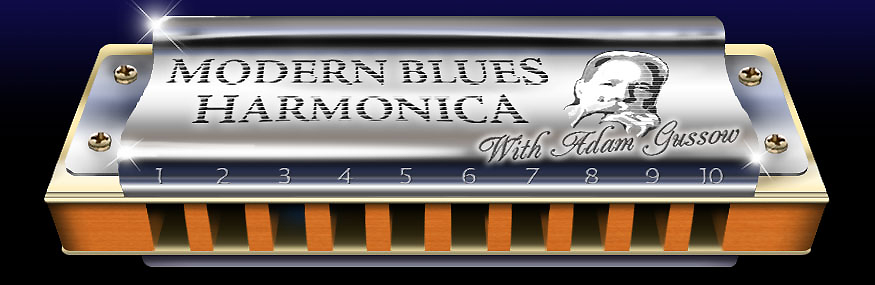
kudzurunner
622 posts
Aug 02, 2009
3:30 PM
|
I'm grateful to all who have expended heart and soul on this design thing.
I just came across a website that lets an idiot like me design graphics. I'm going to post a few things I've come up with.

Image by Cool Text: Logo and Button Generator - Create Your Own

Image by Cool Text: Logo and Button Generator - Create Your Own
Last Edited by on Aug 02, 2009 3:42 PM
|
jonsparrow
721 posts
Aug 02, 2009
9:13 PM
|
is every one afraid to comment now?
|