Rick Davis
2565 posts
Oct 21, 2013
10:33 AM

|
Nate, it needs a favicon.
----------
-Little Rick Davis
The Blues Harp Amps Blog
The Mile High Blues Society
|
tookatooka
3552 posts
Oct 21, 2013
11:37 AM
|
I thought that some time ago. I'll do it! I'll do it! Le'me do it? The only problem is I think Adam uses Macs which may not be Favicon friendly. If Adam agrees and is able to use one, maybe a little competition to design a good one? If this is an off the shelf forum it may not be possible to add it to the code.
|
nacoran
7241 posts
Oct 21, 2013
8:47 PM
|
Hmm, I'll look through the site support material and see if it's possible. Nice idea.
----------
Nate
Facebook
Thread Organizer (A list of all sorts of useful threads)
|
Greg Heumann
2423 posts
Oct 22, 2013
8:21 AM
|
Macs are fine with faviocons. My site has one and I did all the work on a Mac. Nate if my memory is correct you only need to have the file in the sites's main directory - no changes to your HTML. If you google it you'll find plenty of info.
----------
***************************************************
/Greg
BlowsMeAway Productions
See my Customer Mics album on Facebook
BlueState - my band
Bluestate on iTunes
Last Edited by Greg Heumann on Oct 22, 2013 8:22 AM
|
nacoran
7242 posts
Oct 22, 2013
9:50 AM
|
Yeah, I looked through their support, and talked to the boss. We are go for a Favicon. :)
So, do we have enough artists interested for a contest, or is Tooka on his own? Any ideas for the design?
LSC, it's that little symbol you see when you bookmark a page or at the top of your browser tab that lets you know what page is open, like the blue field with the f in it for Facebook or the golden square for Nat Geo.
----------
Nate
Facebook
Thread Organizer (A list of all sorts of useful threads)
Last Edited by nacoran on Oct 22, 2013 9:54 AM
|
Frank
3051 posts
Oct 22, 2013
10:00 AM
|
is'nt this one already?
 Last Edited by Frank on Oct 22, 2013 10:02 AM
|
Rick Davis
2574 posts
Oct 22, 2013
10:01 AM
|
I'd offer to design the favicon but I have no art in my soul at all (as you can tell by my playing). I'm a monster with application development but my user interfaces look like 70's industrial apps. I'm a technician, not an artist.
----------
-Little Rick Davis
The Blues Harp Amps Blog
The Mile High Blues Society
|
nacoran
7243 posts
Oct 22, 2013
10:39 AM
|
That's a header Frank! I suspect by the time it was shrunk down to favicon size it would be illegible.
http://furlongdesign.com/2010/06/17/how-to-make-a-good-favicon-for-your-website/
----------
Nate
Facebook
Thread Organizer (A list of all sorts of useful threads)
|
nacoran
7244 posts
Oct 22, 2013
11:05 AM
|

----------
Nate
Facebook
Thread Organizer (A list of all sorts of useful threads)
|
tookatooka
3553 posts
Oct 22, 2013
11:07 AM
|
A favicon is just a small icon which you can put into your website which will show up in your list of favorites. In fact it will show up in a number of places should you decide to use one.

Depending on your browser, it will show up in the title bar like mine does in the image above and also on your favorites bar. The lower arrow is pointing to a default Internet Explorer favicon because the site does not have its own.

The image above shows a list of my favorites in Google Chrome and the arrows point to websites which do not have a favicon.
Favicons are not really necessary but it makes the site stand out in any favorite lists and bookmark bars because it doesn't use the boring default icon. It gives the site a little more mojo.
You only have a 16 x 16 pixel size to play with so you need to pack in as much as you can.
Last Edited by tookatooka on Oct 22, 2013 11:07 AM
|
Greg Heumann
2425 posts
Oct 22, 2013
11:08 AM
|
Everything you needed to know can be found here: http://en.wikipedia.org/wiki/Favicon
Most are only 16x16 pixels.
----------
***************************************************
/Greg
BlowsMeAway Productions
See my Customer Mics album on Facebook
BlueState - my band
Bluestate on iTunes
|
nacoran
7245 posts
Oct 22, 2013
11:09 AM
|
Hmm, that's a 16x16. 32x32 is pretty common too. I guess it depends on your browser. Apparently, you can save multiple resolutions in .ico files, so entries should have a 16x16 and a 32x32. Larger files can be saved too, but no browser supports them (for now). (Next size up would be 64x64.)
----------
Nate
Facebook
Thread Organizer (A list of all sorts of useful threads)
|
tookatooka
3554 posts
Oct 22, 2013
11:16 AM
|

|
kudzurunner
4320 posts
Oct 22, 2013
11:41 AM
|
favicon is made by fusing fav (as in "favorites") and icon
fav + icon = favicon
|
nacoran
7246 posts
Oct 22, 2013
11:42 AM
|
Looks nice Tooka, but it's a little too dark to make out details at that size.
My little harmonica has a blue 3rd, but you probably can't make that out. It's hard to even tell it's a harmonica!
(Hmm, also looks like I missed the forum red color on the lettering by a couple shades.)
----------
Nate
Facebook
Thread Organizer (A list of all sorts of useful threads)
Last Edited by nacoran on Oct 22, 2013 11:44 AM
|
tookatooka
3555 posts
Oct 22, 2013
11:50 AM
|
Yeah, I'll do some more and put them on here as time allows.
|
tookatooka
3556 posts
Oct 22, 2013
1:55 PM
|

|
tookatooka
3557 posts
Oct 22, 2013
2:25 PM
|


|
MindTheGap
21 posts
Oct 23, 2013
1:50 AM
|
Here a couple of suggestions. I think it's good to use the existing colours of the site.


|
Frank
3057 posts
Oct 23, 2013
3:24 AM
|
The (MBH) seems perfectly logical :)

|
isaacullah
2553 posts
Oct 23, 2013
7:39 AM
|
I like the little Gussow head on a black background.
----------

YouTube! Soundcloud!
|
Rick Davis
2582 posts
Oct 23, 2013
9:14 AM
|
Orange (like the color you see to the left and top of this page) with the letters MBH seems like a good idea. There is no point in putting any detail in it since it is too small to see.
----------
-Little Rick Davis
The Blues Harp Amps Blog
The Mile High Blues Society
|
JInx
597 posts
Oct 23, 2013
10:47 AM
|

Sun, sun, sun
Burn, burn, burn
Soon, soon, soon
Moon, moon, moon
Last Edited by JInx on Oct 23, 2013 11:04 AM
|
Rick Davis
2583 posts
Oct 23, 2013
11:09 AM
|
Jinx, that is pretty cool.
----------
-Little Rick Davis
The Blues Harp Amps Blog
The Mile High Blues Society
|
JInx
598 posts
Oct 23, 2013
11:30 AM
|
Thanks Rick, that's a jpeg. The true icon file should render brighter and sharper.
----------
Sun, sun, sun
Burn, burn, burn
Soon, soon, soon
Moon, moon, moon
|
nacoran
7247 posts
Oct 23, 2013
4:33 PM
|
I like that JInx- it stands out better than my harmonica.
Frank, if you could photoshop those antennas in a harp rack, you might be on to something!
Rick, it probably depends on the screen size. I've got my living room set up so I use my TV for a monitor. It's not big by TV standards, but 37 inches lets me see some pretty good detail. Tooka's Adam's head, I can tell it's Adam (or an elf!) I like the Sonny Boy II also.
----------
Nate
Facebook
Thread Organizer (A list of all sorts of useful threads)
|
Rick Davis
2584 posts
Oct 23, 2013
5:07 PM
|
It is a branding issue. The favicon needs to convey the theme of the website, I think.
----------
-Little Rick Davis
The Blues Harp Amps Blog
The Mile High Blues Society
|
nacoran
7248 posts
Oct 23, 2013
8:14 PM
|
Yeah, I agree. It's too bad the main logo wouldn't be legible at that size- it says it all, and on a harmonica.
I'm looking down my favorites bar at some of the favicons-
Cracked, Wired, Facebook, Fark, TED, Lifehacker, they all go with one or two letters written clearly. Microsoft uses there colorful Windows butterfly. They probably can get away with it because they spend a lot of money on branding. The Cheeseburger Network (parent of Failblog) uses a cheeseburger. Inhabitat uses a cute little green owl.

Well, except I seem to have recreated the Mets logo...
----------
Nate
Facebook
Thread Organizer (A list of all sorts of useful threads)
Last Edited by nacoran on Oct 23, 2013 8:44 PM
|
nacoran
7249 posts
Oct 23, 2013
9:05 PM
|

Here is a link to a nice little site that lets you generate them. I'm discovering that by changing the shades a bit you can get a little depth to the letters. I think my earlier try with the light blue worked better on that account. It's kind of fun to draw them, but it's keeping me from herding my dollar bill origami elephants, so I should probably get back to them before they eat all the peanuts.
http://www.favicon.cc/
----------
Nate
Facebook
Thread Organizer (A list of all sorts of useful threads)
Last Edited by nacoran on Oct 23, 2013 9:08 PM
|
MindTheGap
22 posts
Oct 24, 2013
12:04 AM
|
I think all these suggestions are good, and some much better that my simple, boring (logical!) MBH. But really a favicon should really not be something new and creative itself, it should echo something already familiar on the site, because it's about recognition. If MBH had a logo, you might try to replicate that in 16x16, but it doesn't so letters and colours are the best bet. There is the 'big harp' image, but it would be a challenge to represent that in 16x16.
I do like tooka's 'Adam's Head' and Jlnx 'harp + notes' and nacaron's 'harp + mbh' better than mine. If you adopt one of these, you should really change the website to add it as bigger logo.
In the UK, the BBC has often been taken as a touchstone in tasteful web design. Their favicon is 'BBC', white non-anti-aliased letters on a black background.
|
MindTheGap
23 posts
Oct 24, 2013
8:53 AM
|
Lmbrjak - I agree about the honouring thing. I think that Adam's legion of students might recognise the icon, as we have been staring at his face for a long, long time. But anyone else might just see a strange blob.
If his face were the logo on the site, then that might ok. To do it all properly, the site needs a logo and the icon to reflect that.
|
isaacullah
2555 posts
Oct 24, 2013
12:14 PM
|
What about something simple, like an orange "M" on a black background?

----------
YouTube! Soundcloud!
|
isaacullah
2556 posts
Oct 24, 2013
12:18 PM
|
Or even on an off-white background?

----------
YouTube! Soundcloud!
|
isaacullah
2557 posts
Oct 24, 2013
12:23 PM
|
Oh, oh! What about this one??

EDIT: here's what it would like in the URL bar...

----------
YouTube! Soundcloud!
Last Edited by isaacullah on Oct 24, 2013 12:25 PM
|
MindTheGap
24 posts
Oct 24, 2013
12:27 PM
|
isaacullah - that's it (IMO)! It's got two colours from the site and good clear letters.
Not sure the preview does it justice.
Last Edited by MindTheGap on Oct 24, 2013 12:28 PM
|
isaacullah
2558 posts
Oct 24, 2013
12:29 PM
|
Thanks! Fixed the preview so it should be clearer now!
----------
YouTube! Soundcloud!
|
MindTheGap
25 posts
Oct 24, 2013
1:12 PM
|
Great. If there is a vote, I vote for that one :)
|
nacoran
7250 posts
Oct 24, 2013
2:17 PM
|
I kind of like Isaac's M on a black field. It pops a little more than the off-white.
Of course, it raises the whole issue of modern, blues, harmonica emphasis... lol. Is there room on that one to round the corners a little, maybe one pixel off each corner? I'm not sure if it would look better or not, but I'd like to compare them.
Tooka, I like Lmbrjck's idea of a blue Adam too. That's beyond my skill level though. What do you think?
----------
Nate
Facebook
Thread Organizer (A list of all sorts of useful threads)
|
tookatooka
3558 posts
Oct 24, 2013
2:25 PM
|

Just a thought, we're all assuming Adam chose orange because he liked it but maybe it was the only stock colour available for the forum at the time. I always wondered why it wasn't blue. Maybe he would change it if he was starting again?
Last Edited by tookatooka on Oct 24, 2013 2:33 PM
|
nacoran
7253 posts
Oct 24, 2013
4:33 PM
|
Ooo, I like that one Tooka!
----------
Nate
Facebook
Thread Organizer (A list of all sorts of useful threads)
|
isaacullah
2559 posts
Oct 25, 2013
7:22 AM
|
Nate: You mean like this: 
How about this one? 
----------
YouTube! Soundcloud!
Last Edited by isaacullah on Oct 25, 2013 7:29 AM
|
jim
1476 posts
Oct 25, 2013
7:50 AM
|
>>The only problem is I think Adam uses Macs which may not be Favicon friendly.
what? macs developed the favicon standard AFAIK
----------

Free Harp REPAIR Center
|
tookatooka
3559 posts
Oct 25, 2013
9:20 AM
|
"macs developed the favicon standard AFAIK" Hmmm, Not according to this Jim. It was Microsoft
http://ruthlessray.wordpress.com/2013/09/02/inventing-favicon-ico/
|
nacoran
7254 posts
Oct 25, 2013
10:00 AM
|
Will give it a couple more days for ideas to come in, then we can figure out which one. Isaac, yeah, the rounded corners give it a nice polished look.
----------
Nate
Facebook
Thread Organizer (A list of all sorts of useful threads)
|
Frank
3095 posts
Oct 25, 2013
3:36 PM
|
Spock likes the last one that tooka made - look no further, it's sufficiency is beyond logical :)
|
MindTheGap
30 posts
Oct 26, 2013
2:35 AM
|
I know I'm a newcomer, but I do this kind of thing for a living. I'm very fond of this site so I urge to consider these principles of design in making your choice:
- Consistency: the icon should be recognisably from the website. The colours are white-on-orange or black-on-white, so orange-on-white could be ok. There is no orange-on-black or blue or purple, aside from possibly the links in the forum but they aren't really part of the design. There are no rounded-rectangles in the site design.
- Don't put things in boxes (boxes with borders this means). The principle is that graphic elements (images or text) should define their space.
- Choice of colours. Tooka, I do agree that blue would be a more traditional scheme and probably very good. But it's generally accepted that certain colours are considered modern e.g. oranges, purples, lime green etc. Maybe the choice of orange was conscious or an accident or instinctive. Either way, it was correct in design terms as it fits with the 'Modern' in MBH. When I look at other sites that have the obvious choice of blue, my emotional response is 'traditional', 'vintage' etc, which is just fine. When I look at MBH I think 'modern'.
I am talking specifically about graphic design here, not fine art, which I can see is clearly your area of excellence, Tooka! BTW your own website is perfect - your favicon exactly chimes with the home page. And no 'things in boxes' anywhere.
Last Edited by MindTheGap on Oct 26, 2013 2:45 AM
|
MindTheGap
31 posts
Oct 26, 2013
2:56 AM
|
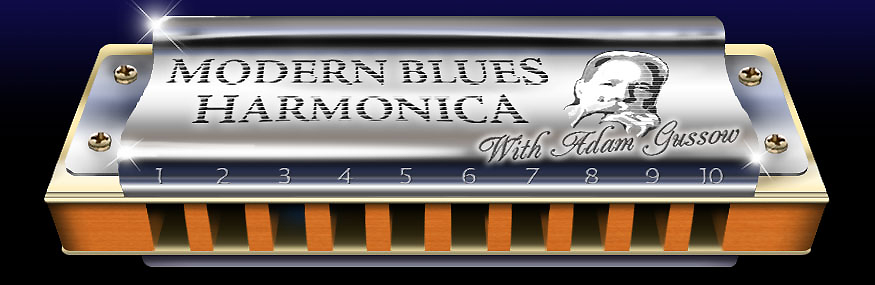
Just a thought, as alternative, you could pick out some detail from the big harmonica header image, which is the first thing you see on the site. e.g. one of the cover screws, or the 10 from the over the ten hole. Or the star-cross light burst.
Or the Bb or 440.
Rich pickings there.
Last Edited by MindTheGap on Oct 26, 2013 2:57 AM
|
nacoran
7267 posts
Oct 27, 2013
11:53 PM
|
Okay, so I'm not seeing any more posts. What do people like?
----------
Nate
Facebook
Thread Organizer (A list of all sorts of useful threads)
|
tookatooka
3560 posts
Oct 28, 2013
3:19 AM
|
I was going to do more Nate but thought I'd wait for feedback first from whoever was going to make the final decision. I didn't know whether we were going in the right direction. I can alter/modify any that I've submitted if need be.
|
ridge
460 posts
Oct 28, 2013
5:33 AM
|
FWIW I like Isaac's diagonal MBH. My vote should count like 50 times since I don't normally give opinions :)
Also, I won the Hill Country Harmonica slogan contest in the past, so that should count for something.
|